Providing users with options can significantly enhance the user experience when building web forms. However, there are situations where you might want to give users the flexibility to either pick from a predefined set of options or enter a custom value. This is where the <datalist> element in HTML comes into play, offering the best of both worlds: a dropdown list combined with the ability for users to input their custom values.
Let’s break down the following piece of HTML code to understand how this works:
<!DOCTYPE html>
<html lang="en">
<head>
    <meta charset="UTF-8">
    <meta name="viewport" content="width=device-width, initial-scale=1.0">
    <title>Custom Framework</title>
<input list="frameworks" />
<datalist id="frameworks">
    <option>January</option>
    <option>March</option>
    <option>July</option>
    <option>August</option>
    <option>September</option>
</datalist>
</body>
</html>
The <input> and <datalist> Elements
In this code snippet, we have an <input> element that is linked to a <datalist> element. The list attribute of the <input> element is set to "frameworks", which corresponds to the id attribute of the <datalist> element. This linkage enables the input field to display a dropdown list of options defined within the <datalist> element when the user interacts with it.
The <datalist> element contains several <option> elements, each representing a different value that the user can select. In this case, the options are popular front-end frameworks: Bootstrap, Tailwind CSS, Foundation, Bulma, and Skeleton.
How It Works
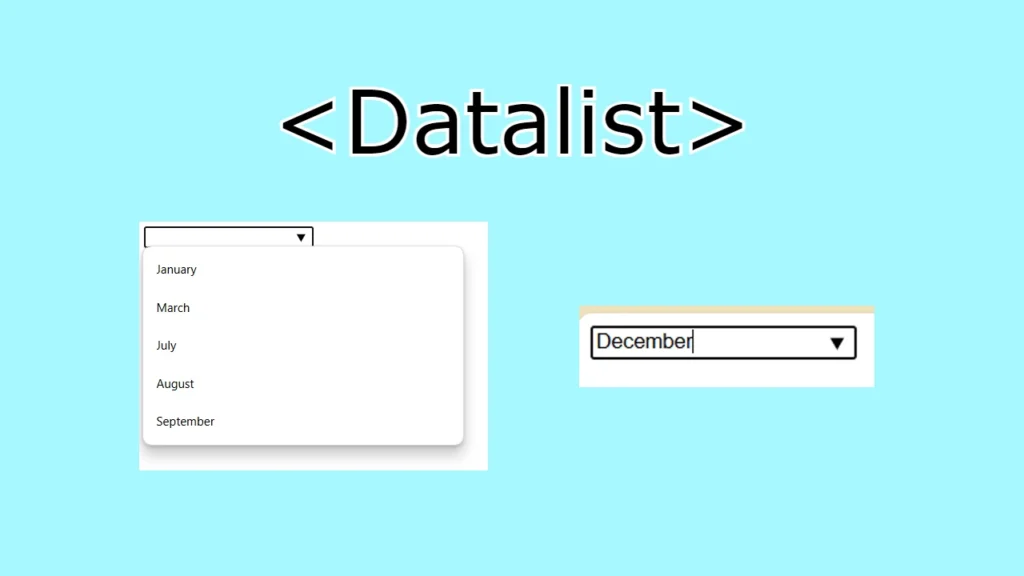
When the user clicks on the input field or begins typing, the browser displays a dropdown list showing the available options from the <datalist>. The user can then click on one of these options to fill the input field, much like a traditional <select> dropdown.
However, unlike a regular dropdown menu, the <datalist> element does not restrict the user to only selecting predefined options. The input field remains editable, allowing the user to type and submit any custom value they desire, even if it’s not listed in the <datalist> options.
For example, if the user starts typing “Boo”, the dropdown might show “Bootstrap” as a suggestion. The user can then either select “Bootstrap” from the list or continue typing to enter a completely different value like “Boothstrap” or anything else that fits their needs.
Benefits of Using <datalist>
- Enhanced User Experience: The
<datalist>element enhances the user experience by providing suggestions as the user types, making it easier and faster for them to fill out the form. - Flexibility: While dropdown menus can be restrictive,
<datalist>provides flexibility by allowing users to enter custom values if none of the suggested options fit their needs. - Reduced Errors: By offering suggestions,
<datalist>can help reduce the likelihood of user errors, especially in cases where the user might misspell a commonly used value. - Lightweight and Native: Unlike some autocomplete implementations that require JavaScript,
<datalist>is a lightweight, native HTML feature that works out of the box across most modern browsers.
Final word
The <datalist> element is a powerful tool for creating dynamic and user-friendly input fields. It combines the convenience of a dropdown menu with the flexibility of a text input, allowing users to select from a list of predefined options or input custom values. This makes it an excellent choice for forms that require both guidance and flexibility, helping to streamline user input while maintaining adaptability.
