The <details> element in HTML is a versatile and interactive component that allows developers to create collapsible content sections. These sections can hide or reveal additional information when the user clicks on a summary or title. This is particularly useful for FAQs, instructions, or any content that might be secondary but helpful.
Here is the HTML code that we are going to deconstruct:
<!DOCTYPE html>
<html lang="en">
<head>
    <meta charset="UTF-8">
    <meta name="viewport" content="width=device-width, initial-scale=1.0">
    <title>Interactive Details Element Example</title>
    <style>
        /* Customizing the marker for the summary */
        summary::marker {
            font-size: 1.5em;
            content: '🔍'; /* Closed state icon */
        }

        /* Changing the marker when the details element is open */
        [open] summary::marker {
            font-size: 1.5em;
            content: '🔓'; /* Open state icon */
        }

        /* Adding hover effects to the summary */
        summary:hover {
            cursor: pointer;
            background: deeppink;
            color: white; /* Makes text more readable on pink background */
            padding: 5px;
            border-radius: 5px;
        }

        /* Styling the details element */
        details {
            margin: 10px 0;
        }
    </style>
</head>
<body>
    <h1>Interactive Details Section</h1>

    <details open>
        <summary>Click to Learn More About HTML</summary>
        <p>HTML stands for HyperText Markup Language. It's the standard markup language for creating web pages. It describes the structure of a web page using a series of elements and tags.</p>
    </details>

    <details>
        <summary>Click to Reveal a CSS Tip</summary>
        <p>CSS stands for Cascading Style Sheets. It's used to control the look and feel of web content. You can control everything from the font, colors, layout, and even animations using CSS.</p>
    </details>

    <details>
        <summary>Click to Uncover a JavaScript Fact</summary>
        <p>JavaScript is a versatile programming language commonly used in web development. It allows developers to create dynamic and interactive experiences, such as form validation, interactive maps, and more.</p>
    </details>
</body>
</html>Basic Structure of the <details> Element
The <details> tag is relatively simple in its structure. It contains two primary components: the <summary> element and the content you want to hide or show. Here’s a basic example:
<details>
        <summary>Click to Reveal a CSS Tip</summary>
        <p>CSS stands for Cascading Style Sheets. It's used to control the look and feel of web content. You can control everything from the font, colors, layout, and even animations using CSS.</p>
</details>
In this code, the “Click to Reveal a CSS Tip” part acts as the clickable area (the summary), and “CSS stands for Cascading Style Sheets. It's used to control the look and feel of web content. You can control everything from the font, colors, layout, and even animations using CSS.” is the content that will be shown or hidden when the user interacts with the summary.
Automatically Opening the <details> Element
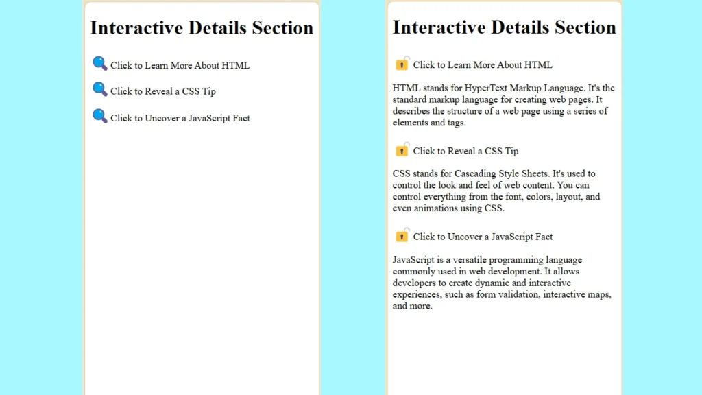
If you want the <details> element to be open by default when the page loads, you can add the open attribute directly to the <details> tag:
<details open>
        <summary>Click to Learn More About HTML</summary>
        <p>HTML stands for HyperText Markup Language. It's the standard markup language for creating web pages. It describes the structure of a web page using a series of elements and tags.</p>
    </details>
By doing so, the content inside the <details> will be visible without requiring user interaction.
Customizing the Marker with CSS
The marker (the default triangle or arrow) that appears next to the summary text can be customized using CSS. This customization can be particularly useful for enhancing the user experience and aligning the design with the rest of the website.
The following CSS code snippets allow you to change the marker’s content and style:
summary::marker {
    font-size: 1.5em;
    content: '🔍';
}

[open] summary::marker {
    font-size: 1.5em;
    content: '🔓';
}
In this example, when the <details> element is closed, the marker is displayed as a magnifying glass (🔍). When the <details> element is open, the marker changes to an unlocked padlock (🔓). Additionally, the font-size property is set to 1.5em, making the marker more prominent.
Enhancing User Interaction with Hover Effects
Another great way to improve the user interface is by adding a hover effect to the <summary> element. This effect can make the element more interactive and provide visual feedback to the user.
/* Adding hover effects to the summary */
        summary:hover {
            cursor: pointer;
            background: deeppink;
            color: white; /* Makes text more readable on pink background */
            padding: 5px;
            border-radius: 5px;
        }
In this CSS snippet, when the user hovers over the summary, the cursor changes to a pointer, and the background color turns to deep pink. This makes the element more attractive and indicates that the summary is clickable.
Conclusion
The <details> element is a powerful tool in HTML for creating interactive and user-friendly content sections. By using attributes like open and combining them with CSS customizations, you can create a dynamic and engaging web experience. Whether you’re looking to hide complex content or add a bit of flair to your website, the <details> element is a versatile and straightforward solution.


