Test Details
- Test Name: Accessibility Compliance for Checkout Page
- Objective: Ensure the checkout page complies with WCAG 2.1 AA guidelines, providing an inclusive experience for users with disabilities.
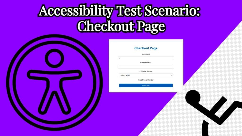
Here is the app that we are going to test:
Preconditions
- Access the checkout page on a browser with keyboard navigation, screen reader (e.g., NVDA, JAWS), and accessibility tools (e.g., Lighthouse or axe).
- Ensure the browser supports ARIA and semantic HTML elements. To check this you have to go to browser settings and find the accessibility settings there.
- Set the viewport to standard desktop (1366px) and mobile (375px) dimensions.
Test Steps and Observations
- Page Structure Validation
- Step: Verify the page structure using a screen reader.
- Expected: The screen reader announces the page title “Checkout Page” and reads the headings, labels, and inputs in a logical, hierarchical order.
- Observed:
- Headings are appropriately structured (e.g.,
<h1>for the page title). - Labels are associated with their inputs using
forattributes.
- Headings are appropriately structured (e.g.,
- Keyboard Navigation
- Step: Navigate the page using the
Tabkey. - Expected:
- Focus moves sequentially through all actionable elements (e.g., input fields, dropdown, buttons).
- Focus indicators are clearly visible.
- Observed:
- All interactive elements are tabbable, and focus indicators are prominent.
- Step: Navigate the page using the
- Form Field Accessibility
- Step: Verify each input field’s label and
aria-requiredattributes. - Expected:
- Labels are read correctly.
- Errors are announced when fields are invalid or empty.
- Observed:
- Error messages use
aria-live="polite"to ensure screen readers announce them dynamically. - Required fields are marked with
aria-required="true".
- Error messages use
- Step: Verify each input field’s label and
- Dynamic Content Updates
- Step: Select “Credit Card” from the “Payment Method” dropdown.
- Expected:
- The credit card field becomes visible and is focusable.
- Screen reader announces its presence and availability.
- Observed:
- The credit card field visibility toggles dynamically, and its accessibility attributes adjust accordingly.
- Color Contrast
- Step: Use a color contrast tool to check the contrast ratio of text and backgrounds.
- Expected:
- Text contrast meets WCAG 2.1 AA requirements (4.5:1 for normal text, 3:1 for large text).
- Observed:
- Text color (#333) on a white background passes contrast checks.
- Buttons have sufficient contrast against their backgrounds.
- Validation Feedback
- Step: Submit the form with missing or invalid inputs.
- Expected:
- Error messages are displayed below each invalid field.
- Screen readers announce the errors in real time.
- Observed:
- Validation feedback is dynamically updated and announced via
aria-live.
- Validation feedback is dynamically updated and announced via
- Mobile Responsiveness
- Step: Resize the viewport to 375px (mobile).
- Expected:
- Form fields and buttons adjust to fit the screen without horizontal scrolling.
- Observed:
- The layout remains accessible and visually consistent.
- Semantic HTML
- Step: Inspect the HTML structure.
- Expected:
- Semantic elements like
<form>,<label>, and<button>are used appropriately.
- Semantic elements like
- Observed:
- All elements are semantic and correctly structured.
- Error Prevention
- Step: Submit the form after selecting “Credit Card” but leaving the card number field blank.
- Expected:
- A clear error message appears.
- Form submission is prevented.
- Observed:
- Error message “Card number is required” is displayed, and submission is blocked.
Test Results
| Test Case | Expected Result | Observed Result | Status |
|---|---|---|---|
| Page structure validation | Logical and hierarchical | As expected | ✅ Pass |
| Keyboard navigation | Smooth and sequential | As expected | ✅ Pass |
| Form field accessibility | Labels and ARIA attributes | As expected | ✅ Pass |
| Dynamic content updates | Visible and focusable fields | As expected | ✅ Pass |
| Color contrast | Meets WCAG 2.1 AA standards | As expected | ✅ Pass |
| Validation feedback | Real-time error announcements | As expected | ✅ Pass |
| Mobile responsiveness | Responsive and accessible | As expected | ✅ Pass |
| Semantic HTML | Properly used | As expected | ✅ Pass |
| Error prevention | Prevents invalid submissions | As expected | ✅ Pass |
Recommendations
- Add visual hints (e.g., asterisk
*) to required fields for additional clarity. - Include skip links for quick navigation to the main content.
- Test with additional assistive technologies (e.g., VoiceOver on macOS/iOS).


