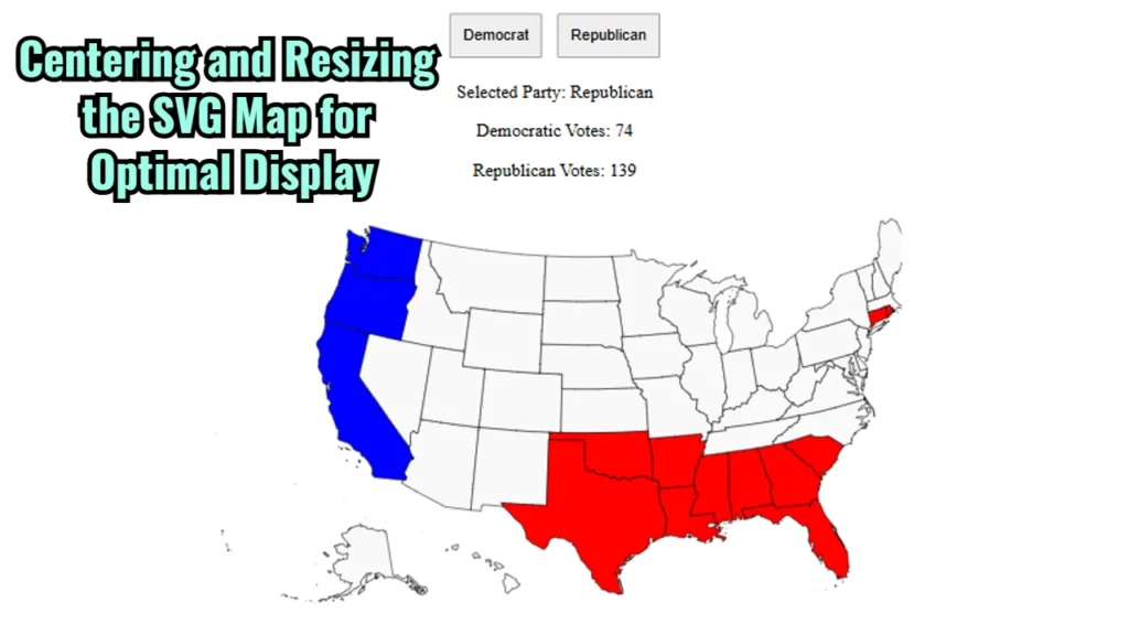
While working on an application featuring an interactive SVG map, I encountered an issue where the map was not centered correctly on the screen and did not resize optimally to fit within the viewport. This document explains the initial issue, the attempted solutions, and the final CSS implementation that resolved the problem.
Issue Description
The SVG map needed to:
- Be smaller to fit within the screen more comfortably.
- Be horizontally centered to improve user experience.
However, the map was either stretching too large or disappearing entirely when resizing adjustments were attempted, likely due to restrictive max-width constraints and improper centering.
Initial Solution Attempt
To address this, the initial approach involved adding a container div for the map and centering it with display: flex; on the container. We also experimented with max-width and height constraints directly on the SVG map to control its size. However, this caused the SVG to disappear, likely because max-width restricted its size excessively, making it difficult to render correctly.
Final Solution
The final, effective solution was to adjust the CSS as follows:
- Centering: Used a container
divwithdisplay: flex;andjustify-content: center;to horizontally center the SVG map. - Resizing: Set the SVG width to
60vw(60% of the viewport width), allowing it to adapt responsively. Theheight: auto;maintains the aspect ratio, ensuring the map doesn’t stretch disproportionately.
Here’s the final CSS implementation:
body {
    font-family: 'Times New Roman', Times, serif, sans-serif;
    text-align: center;
}

.map-container {
    display: flex;
    justify-content: center; /* Center the SVG horizontally */
    margin-top: 20px;
}

#usMap {
    width: 60vw; /* Set to 60% of the viewport width for a manageable size */
    height: auto; /* Maintain aspect ratio */
}
Outcome
With these changes, the SVG map now displays in the desired position, correctly sized, and centered within the viewport. This solution ensures a better user experience, especially on screens with varying sizes, as the map now scales responsively while retaining its interactivity.
You may reference the complete app code here: https://github.com/NoToolsNoCraft/US-Election-Calculator-2024


