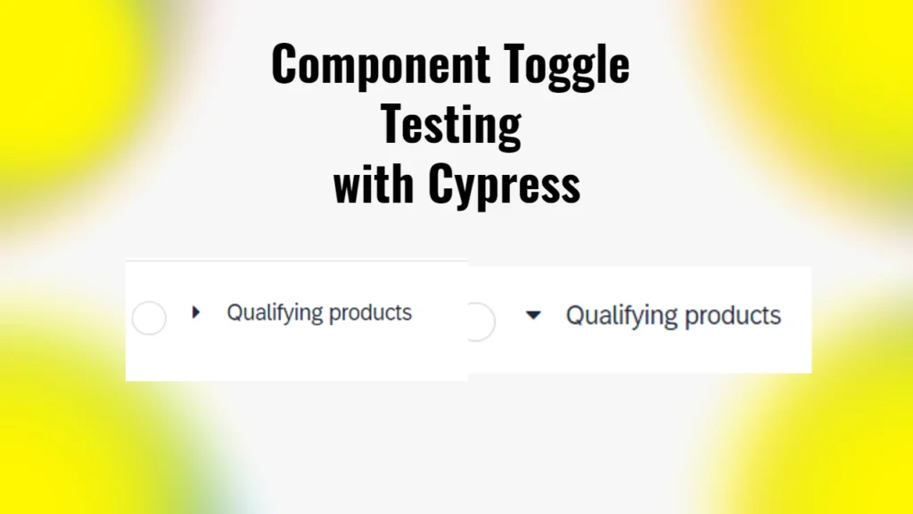
While working on testing within the SAP Hybris environment, I faced a challenge when testing a toggle component in my application. The component I was dealing with was labeled “Qualifying products,” it had a functionality that showed or hid additional content based on whether it was open or closed.
This situation required a precise approach to ensure that the component was interacted with correctly during the testing process.
Understanding the Component Structure
The “Qualifying products” component was structured with specific HTML elements. Here’s the full HTML snippet for reference:
<div id="p41Hol9" class="yrb-condition yrb-condition-y_qualifying_products z-div" data-drop-target="true" data-drop-keys="ruleCondition,ruleConditionDefinition" data-drag-key="ruleCondition">
  <div id="p41Hpl9" class="yrb-condition-handle z-div"></div>
  <div id="p41Hql9" class="yrb-condition-content z-div">
    <div id="p41Hrl9" class="z-groupbox z-groupbox-3d">
      <div id="p41Hrl9-header" class="z-groupbox-header">
        <div id="p41Hsl9" class="yrb-condition-caption">
          <span id="p41Hsl9-toggle" class="sr-only sr-only-focusable" role="button" tabindex="0" aria-expanded="false" title="Collapse"></span>
          <div id="p41Hsl9-cave" class="yrb-condition-caption-content">
            <div id="p41Hwl9" class="yrb-node"></div>
            <i id="p41Hyl9" class="z-icon-caret-right"></i>
            <span id="p41Hxl9" class="z-label">Qualifying products</span>
            <button type="button" id="p41Htl9" class="yrb-delete-btn ye-delete-btn">
              <i class="z-icon-times-circle-o" aria-hidden="true"></i>
            </button>
          </div>
          <div id="p41Hrl9-icons" class="z-groupbox-icons"></div>
        </div>
      </div>
      <div id="p41Hrl9-cave" style="display:none;border:1px solid"></div>
    </div>
  </div>
</div>
In this structure, the key elements that I focused on were:
- Label Element: The span with the class
z-labelcontaining the text “Qualifying products.” - Caret Icon: The icon element
<i>that can either have the classz-icon-caret-right(indicating the component is closed) orz-icon-caret-down(indicating the component is open).
The Initial Challenge
My initial attempts to interact with this component involved straightforward queries and clicks. However, I encountered issues when trying to determine whether the component was open or closed. Specifically, I received an error that indicated a type mismatch when I tried to use jQuery methods on the elements I retrieved with Cypress. This led me to explore a more effective way to handle the toggle functionality.
The Solution
After some trial and error, I refined my approach. I created a Cypress custom command that effectively checks the state of the “Qualifying products” component and interacts with it appropriately. Here’s the final version of the command that solved my issue:
cy.get('span.z-label').contains('Qualifying products').then(($label) => {
    // Ensure we are targeting the correct component by navigating to the parent
    const parent = $label.closest('div.yrb-condition');

    // Wrap the parent and check for the caret icon using class names
    cy.wrap(parent).find('i').then(($icon) => {
      if ($icon.hasClass('z-icon-caret-right')) {
        // The caret is pointing right, so we need to click to open
        cy.wrap($label).click();
      } else if ($icon.hasClass('z-icon-caret-down')) {
        // The caret is already pointing down, meaning it's open, so do nothing
        cy.log('Qualifying products is already open');
      }
    });
  });
Breakdown of the Command
- Finding the Component: The command starts by locating the span element with the label “Qualifying products.” This is done using the
cy.get()command combined withcontains(), which ensures that we are targeting the correct element. - Navigating to the Parent: Once the label is found, I used
closest()to navigate to the parentdivthat contains the component. This ensures that any subsequent actions are contextual to the right component. - Checking the Icon State: The next step involved wrapping the parent in a Cypress chainable object and searching for the icon element. By checking the class names of the icon (
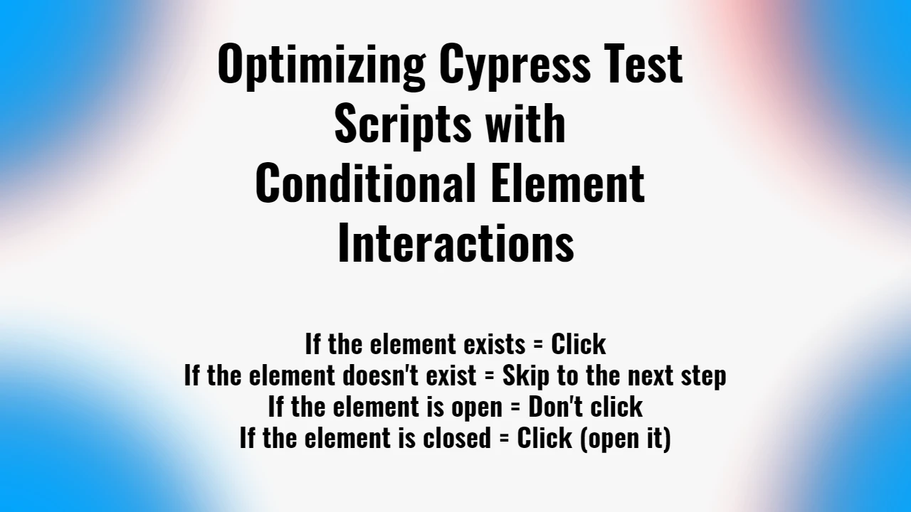
z-icon-caret-rightandz-icon-caret-down), I could determine whether the component was open or closed. - Conditional Interaction: If the icon indicated the component was closed (pointing right), the command clicked on the label to open it. If it was already open (pointing down), the command logged that the component was already expanded, allowing the test to proceed without unnecessary clicks.
