This guide is here to help you set up CSS variations in AEM Components, making it super easy for authors to toggle between different styles right in the AEM editor. In this example, we’ll whip up two style options: one with a white background and another with a blue background, all while using the Less framework for CSS.
Step 1: Creating CSS Styles with BEM Methodology
We will start by defining two style variations using the BEM methodology. Below is an example using the Less framework:
// Base component styles for .cmp-articlelist
.cmp-articlelist {
  // Default style, if needed
  &__cards {
    padding: 20px;
    border-radius: 5px;
  }

  // Modifier for white background
  &--white-background {
    &__cards {
      background-color: #FFF; // White background for cards
      color: #333; // Darker text for better contrast
    }
  }

  // Modifier for blue background
  &--blue-background {
    &__cards {
      background-color: #007bff; // Blue background for cards
      color: #FFF; // White text for better contrast
    }
  }
}
Explanation:
- Block (
.cmp-articlelist):- This is the main component container, which holds all elements inside it.
- Element (
__cards):- Represents specific elements inside the component, such as individual card sections.
- The double underscores (
__) indicate that this is an internal element within thecmp-articlelistblock.
- Modifier (
--white-background,--blue-background):- Modifiers like
--white-backgroundand--blue-backgroundare used to apply different visual styles to the component. These are variations that adjust the component’s background color and associated text colors.
- Modifiers like
Step 2: Implementing CSS Variations in AEM Component
To allow authors to choose between these two styles, follow these steps:
1. Navigate to the Desired Page
- Go to the page where the component you want to style is being used.
2. Open the Page Template
- Click on the Page Properties of the page.
- Select Edit Template to open the template editor.
3. Find the Component
- Locate the component you want to apply styles to in the template structure.
4. Access the Component Policy
- Click on the component in the template editor to select it.
- If the component has a policy, you’ll see a small policy button (gear icon) near the component tab.
Note: If there is no policy button available, this might indicate a backend node issue, and you’ll need to check the component configuration in the backend.
5. Adding Style Options in the Allowed Styles Segment

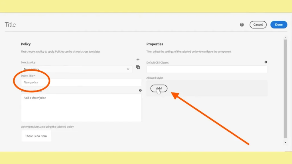
- Click the policy button to open the Component Policy configuration.
- In the Allowed Styles segment, click the Add button to create new style options.
- Fill in the details for each style:
- Style Title: It should be something exact. In our case it can be “Background Color”.
- Style Variant Label: Enter a name that authors will recognize (e.g., “White Background” and “Blue Background”).
- CSS Class: Add the class names you created in the CSS (
cmp-articlelist--white-backgroundandcmp-articlelist--blue-background). The class names should be added in these fields without a dot, @, #, or any other symbol before them.
6. Save Changes
- Once you’ve added the style options, save the changes to the policy.
- Close the template editor.
Step 3: Using the Style Options in AEM
- Go back to the page with your component.
- Open the Component Editor by clicking on the component.
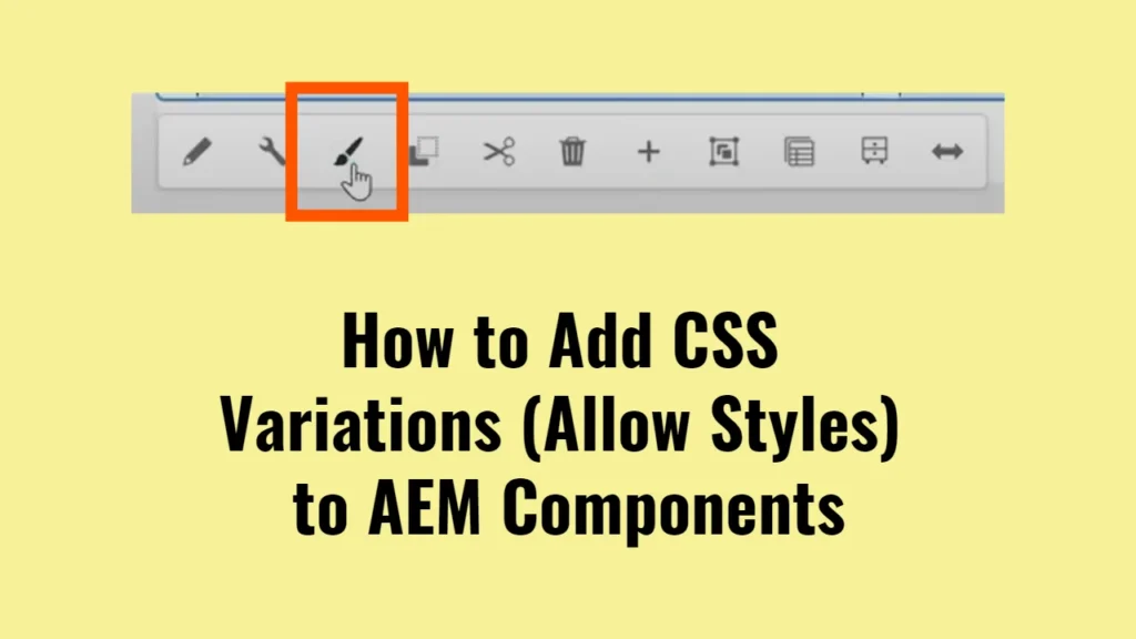
- You should now see a Style tab within the component editor.
- In the Style tab, select the style you want to apply from the dropdown menu (e.g., “White Background” or “Blue Background”).
This will automatically apply the corresponding CSS class (cmp-articlelist–white-background or cmp-articlelist–blue-background) to the component, allowing the selected style variation to be displayed.
Troubleshooting
- No Style Tab: If the Style tab does not appear after saving changes:
- Make sure you have correctly defined the CSS classes in the policy.
- Ensure that the component in the template has a valid policy attached.
- Check for any backend configuration issues that might be affecting component policies.


