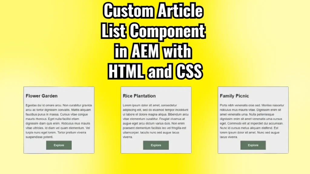
AEM uses a combination of HTML, CSS, and Java components to build the structure and design of the components we see on a page. In this blog post, I’ll walk you through how to create and style a custom Article List Component in AEM, using a real-world example. This component displays a list of articles in three columns, each featuring a title, description, and button.
We’ll go through the provided HTML and CSS code step by step to understand how everything works together.
The Big Picture: What Does This Component Do?
Before diving into the code, let me first explain what this component does. It renders a list of articles in three boxes that align horizontally in a row. Each box represents an article, with a title at the top, a description in the middle, and a button at the bottom that lets users explore the article. The layout uses CSS flexbox for a neat and responsive design, ensuring the boxes are aligned evenly across the page.
Now, let’s break down the provided code.
HTML Structure: Building the Component’s Skeleton
Below is the HTML code for our Article List Component:
<div class="cmp-articlelist">
    <h1 class="cmp-articlelist__heading">This is Article List Component</h1>

    <div data-sly-use.model="com.adobe.aem.guides.wknd.core.models.ArticleListModel"
         class="cmp-articlelist__cards-container">

        <sly data-sly-list.articleList="${model.articleListDataBeanArray}">
            <div class="cmp-articlelist__cards">
                <h2 class="cmp-articlelist__card-title">${articleList.title}</h2>
                <div class="cmp-articlelist__card-desc">${articleList.description}</div>
                <div class="cmp-articlelist__card-btn-container">
                    <a href="#" class="cmp-articlelist__card-btn">Explore</a>
                </div>
            </div>
        </sly>

    </div>
</div>
Breaking It Down
<div class="cmp-articlelist">: This is the main container for the entire article list component. Inside this container, we define the structure for each article.- Class: AEM developers often use a
cmp-prefix to represent “component,” making it easy to identify which parts of the code relate to specific AEM components. Here, the classcmp-articlelistrefers to our article list component.
- Class: AEM developers often use a
<h1 class="cmp-articlelist__heading">: This is the title of the entire component. It’s a basic heading element, and the classcmp-articlelist__headingensures we can style it separately from other headings in the project.<div class="cmp-articlelist__cards-container">: This div contains all the article cards. The classcmp-articlelist__cards-containerindicates that this section will hold multiple article cards, each represented by a box.data-sly-use.model: This attribute is specific to AEM’s Sightly (HTL) templating language. It tells AEM which Java model to use for retrieving data. In this case, it usesArticleListModelto fetch the data for each article (like title, description, etc.).
<sly data-sly-list.articleList="${model.articleListDataBeanArray}">: This is a loop that iterates over an array of article data fetched from the model. The variablearticleListrepresents a single article’s data, such as its title and description.<h2 class="cmp-articlelist__card-title">: This is the title of each individual article. The content inside the tags is dynamically populated with the article’s title using the Sightly${articleList.title}syntax.<div class="cmp-articlelist__card-desc">: This is the description of the article, also dynamically populated using${articleList.description}.<div class="cmp-articlelist__card-btn-container">: This container holds the button for each article. Inside it, there’s an anchor (<a>) element with a classcmp-articlelist__card-btnthat acts as the button.
<a href="#" class="cmp-articlelist__card-btn">Explore</a>: This is the call-to-action button for each article. It uses a basic link (<a>) with anhrefthat directs users to the article when clicked.
CSS Styles: Making It Look Good
Let’s now examine the CSS that styles our component:
.cmp-articlelist__cards-container {
    display: flex;
    justify-content: space-evenly;
}

.cmp-articlelist__cards {
    display: flex;
    flex-direction: column;
    padding: 10px;
    width: 350px;
    border: 1px solid black;
}

.cmp-articlelist__card-btn {
    padding: 15px 40px;
    background-color: #5E7263;
    color: #FFF;
    text-align: center;
}

.cmp-articlelist__card-btn-container {
    text-align: center;
    margin: 20px 0px;
}

.cmp-articlelist__card-title {
    text-align: center;
}
Understanding the CSS
.cmp-articlelist__cards-container:display: flex;: This makes the container a flexbox, allowing easy horizontal alignment of the article cards.justify-content: space-evenly;: This property ensures that the article cards are spaced evenly across the container. Each card will have an equal amount of space on either side, making the layout look neat and balanced.
.cmp-articlelist__cards:display: flex;: This makes each card a flex container. We use flexbox here to align the elements (title, description, button) inside each card vertically.flex-direction: column;: By setting the flex direction to column, the elements inside the card (title, description, and button) are stacked vertically on top of each other.padding: 10px;: This adds some space inside the card, making sure the content doesn’t touch the edges of the card.width: 350px;: Each card has a fixed width of 350 pixels, ensuring uniformity.border: 1px solid black;: This adds a black border around each card, helping them stand out.
.cmp-articlelist__card-btn:padding: 15px 40px;: This adds padding inside the button, making it more clickable and aesthetically pleasing.background-color: #5E7263;: The background color is a muted green (#5E7263), giving it a distinct but not overly bright look.color: #FFF;: This sets the text color of the button to white.text-align: center;: The text inside the button is centered for better readability.
.cmp-articlelist__card-btn-container:text-align: center;: This centers the entire button horizontally within its container.margin: 20px 0px;: This adds vertical space (20px) between the button and other elements in the card (like the description).
.cmp-articlelist__card-title:text-align: center;: This centers the title text horizontally within each card.
How Do HTML and CSS Work Together?
The HTML defines the structure of the component, organizing it into containers, titles, descriptions, and buttons. The CSS then applies styles to these elements, giving them visual characteristics like layout, spacing, colors, and alignment.
The flexbox layout plays a crucial role here. The outer container (cmp-articlelist__cards-container) ensures that the cards are aligned horizontally in a row. Each card, in turn, uses flexbox to stack its content (title, description, and button) vertically.
Final Thoughts
Configuring components in AEM might seem tricky at first, but once you break it down into smaller pieces, it’s quite manageable. We can create a clean, responsive layout for displaying articles by combining HTML for structure and CSS for styling.
The key takeaway is understanding how flexbox is used to align elements both horizontally and vertically, which ensures the design remains flexible and responsive. With the help of AEM’s Sightly (HTL) templating language, we can easily loop through dynamic content, making our component reusable for different articles.


