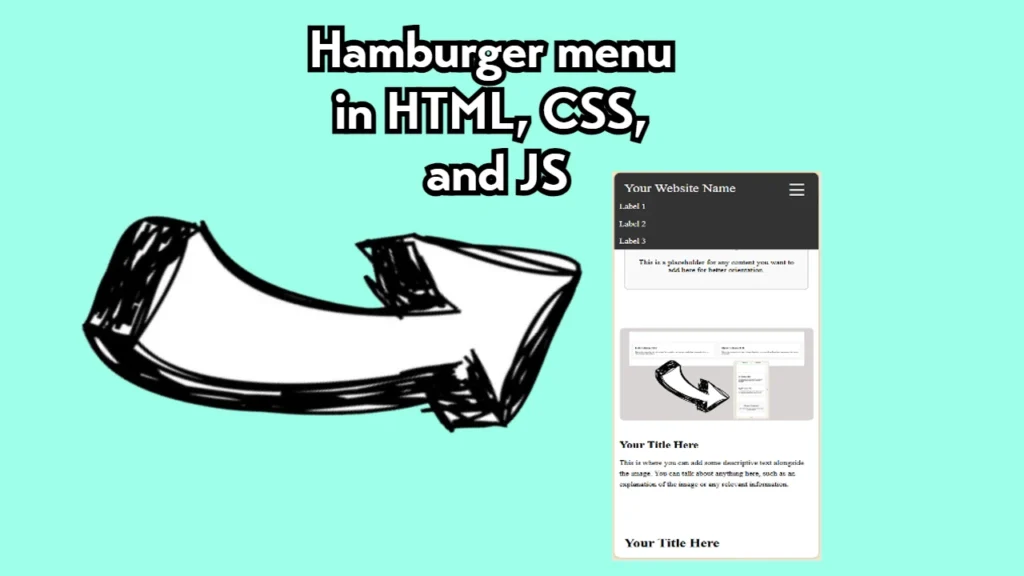
One key component of developing websites that look good across all devices is a responsive navigation menu. A horizontal menu works fine for desktop users, but mobile users typically expect a hamburger menu—a simple button that reveals a vertical list of navigation links.
In this article, I’ll explain how I implemented a responsive hamburger menu using HTML, CSS, and JavaScript. This approach ensures that the website is user-friendly on mobile devices, and the navigation is hidden until the user clicks the hamburger icon.
1. HTML Structure
The structure of the navigation bar is fairly simple. It consists of a header with three main components:
- The website name on the left.
- A hamburger icon for mobile devices.
- A set of navigation links that appear differently depending on whether the user is on a desktop or a mobile device.
Here’s the basic HTML setup:
<!-- Top Menu Bar -->
<header class="top-menu">
<div class="website-name">Your Website Name</div>
<button class="hamburger" aria-label="Toggle Menu">
☰ <!-- This is the hamburger icon -->
</button>
<!-- For Desktop -->
<nav class="menu-items desktop">
<a href="#">Label 1</a>
<a href="#">Label 2</a>
<a href="#">Label 3</a>
</nav>
<!-- For Mobile -->
<div class="dropdown menu-items mobile">
<a href="#">Label 1</a>
<a href="#">Label 2</a>
<a href="#">Label 3</a>
</div>
</header>Key Points:
- The
hamburgerbutton contains the hamburger icon (☰) and is hidden by default on desktops. - The desktop menu (
menu-items desktop) is displayed as a horizontal list of links, while the mobile menu (menu-items mobile) is initially hidden.
2. CSS Styling
To style the navigation bar, I used Flexbox for layout control. The hamburger icon is hidden on desktops but displayed on mobile devices. I also styled the dropdown menu to be hidden by default and to display when triggered.
Here’s how the CSS looks:
/* General Styles */
body {
    font-family: 'Times New Roman', serif, sans-serif;
    margin: 0;
    padding: 0;
    box-sizing: border-box;
}

/* Top Menu Bar */
.top-menu {
    display: flex;
    justify-content: space-between;
    align-items: center;
    background-color: #333;
    padding: 10px 20px;
    color: white;
    position: relative;
}

.website-name {
    font-size: 28px;
}

/* Hamburger Button */
.hamburger {
    background: none;
    border: none;
    color: white;
    font-size: 2.5em;
    cursor: pointer;
    display: none; /* Hidden by default */
}

/* Menu Items for Desktop */
.menu-items {
    display: flex; /* Inline display for desktop */
}

.menu-items a {
    margin-left: 20px;
    text-decoration: none;
    color: white;
    font-size: 1.1em;
}

/* Dropdown for Mobile */
.dropdown {
    display: none; /* Hidden by default */
    flex-direction: column; /* Stack items vertically */
    position: absolute;
    background-color: #333;
    top: 60px;
    left: 0;
    width: 100%;
    z-index: 10;
}

.dropdown.show {
    display: flex; /* Show dropdown when activated */
}

/* Media Queries for Mobile */
@media (max-width: 768px) {
    .hamburger {
        display: block; /* Show hamburger button on mobile */
    }

    .menu-items.desktop {
        display: none; /* Hide desktop menu items */
    }

    .dropdown.show {
        display: flex; /* Display dropdown when triggered */
    }
}
Key Points:
- The hamburger icon is hidden on screens wider than 768px.
- The dropdown menu is stacked vertically and appears when the
.showclass is added via JavaScript. - Media queries ensure that the navigation changes depending on the screen size.
3. JavaScript Functionality
Next, I added the JavaScript functionality to toggle the visibility of the mobile menu. This is triggered when the user clicks the hamburger icon. The JavaScript toggles the .show class, which controls whether the dropdown is visible.
document.addEventListener("DOMContentLoaded", function () {
    const hamburger = document.querySelector(".hamburger");
    const menuItems = document.querySelector(".dropdown");

    hamburger.addEventListener("click", function () {
        menuItems.classList.toggle("show"); // Toggle the show class
    });
});
Key Points:
- The script waits until the page is fully loaded before adding the event listener to the hamburger button.
- Clicking the hamburger toggles the
.showclass on the dropdown, which controls the visibility of the mobile menu.
4. Putting It All Together
With the HTML, CSS, and JavaScript in place, this component ensures that the navigation is sleek and responsive. The hamburger menu only appears on mobile screens, and users can toggle the menu with a single click or tap.
Here’s the final breakdown:
- Desktop: Users see a traditional horizontal navigation bar.
- Mobile: The hamburger icon appears, and the navigation items are hidden until clicked.