Recently, while creating my QR generator app, I encountered an issue related to mobile responsiveness. The issue appeared when the app was used on smartphones in portrait mode. On desktop and in mobile landscape mode, this issue wasn’t appearing.
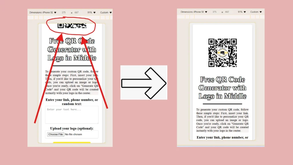
Namely, as you can see in the image at the top, the top part of the app screen is cut off, so only half of the title image is visible. It is at the very top of the page, so I couldn’t scroll up.
The issue was actually caused by this part of my styles code:
body {
      font-family: 'Times New Roman', Times, serif, sans-serif;
      background-color: #f1f1f1;
      display: flex;
      justify-content: center;
      align-items: center;
      height: 100vh;
      margin: 0;
    }
When using the center alignment in the body align-items: center; the browser tries to center the body content vertically and horizontally. So it does not care if the content goes out of the viewport. This may not cause issues on a desktop screen. But when it comes to smaller resolutions like on the mobile phones, this may cut of certain parts on the app.
The resolution is actually pretty simple. Let’s take a look at it:
@media screen and (max-width: 500px) {
  body {
    align-items: flex-start;
  }
}
I’ve added a media query with the following alignment: align-items: flex-start; This made my app perfectly mobile responsive and solved the issue!


