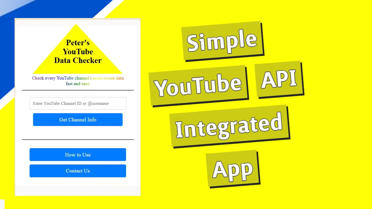
<!DOCTYPE html>
<html lang="en">
<head>
    <meta charset="UTF-8">
    <meta name="viewport" content="width=device-width, initial-scale=1.0">
    <title>Custom Checkbox</title>
    <style>
        input {
            appearance: none;
            position: relative;
            display: inline-block;
            background: lightgrey;
            height: 1.65rem;
            width: 2.75rem;
            vertical-align: middle;
            border-radius: 2rem;
            box-shadow: 0px 1px 3px #0003 inset;
            transition: 0.25s linear background;
        }

        input:before {
            content: '';
            display: block;
            width: 1.25rem;
            height: 1.25rem;
            background: #fff;
            border-radius: 1.2rem;
            position: absolute;
            top: 0.2rem;
            left: 0.2rem;
            box-shadow: 0px 1px 3px #0003;
            transition: 0.25s linear transform;
            transform: translateX(0rem);
        }
        input:checked {
            background: green;
        }

        input:checked:before {
            transform: translateX(1rem);
        }
    </style>
</head>
<body>
    <label>
        <input type="checkbox" />
        I choose this checkbox
    </label>
</body>
</html>
When we add appearance: none to our CSS code, we are basically telling the browser not to replace our elements. Don’t replace it; gimme me a box, and I’ll style it.
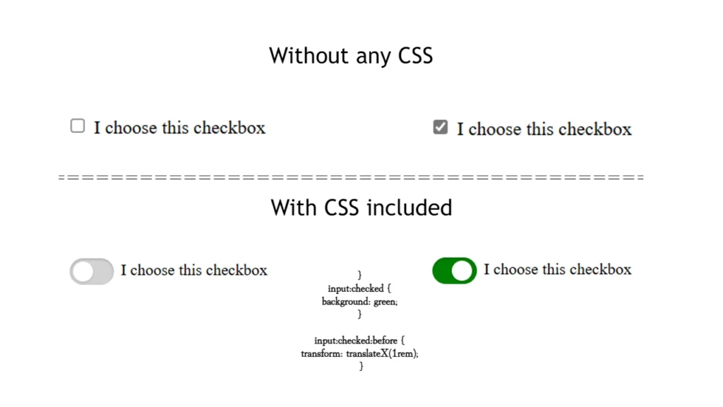
This part of the CSS code is responsible for making the checkbox actually show the changes when it is clicked:
   input:checked {
            background: green;
        }

        input:checked:before {
            transform: translateX(1rem);
        }
Without this, the checkbox will be clicked, but the toggle will not move from left to right or change color, so the user will not be sure if he clicked it or not.
Focus-visible for using the button with a keyboard
input:focus-visible targets elements that receive focus but are deemed as needing a visible focus indicator (usually via keyboard interaction).
input:focus Targets all elements that receive focus.
input:focus-visible {
    outline: 2px solid dodgerblue;
    outline-offset: 2px;
}

input:focus {
    /* This will remove the outline */
    outline: none;

    /* If you want to make the outline transparent */
    outline-color: transparent;
}
You can decide to either remove the outline entirely (outline: none;) or make it transparent (outline-color: transparent;), depending on the behavior you want to achieve.