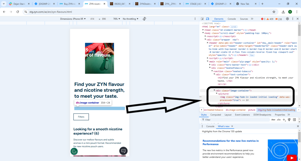
I’ve recently noticed an issue in the mobile view of our page, where an unnecessary spacer appears below the header component. Initially, I suspected that the Page Header Component itself might be responsible for this additional space. However, upon closer inspection, it became clear that this component is structured in two main parts:
- Text Container
- Image Container
Despite no image being added to the image container, it appears that this section still leaves a blank space at its designated slot. This behavior creates the unwanted spacer visible on the mobile view. While this spacer also exists in the desktop view, it is not noticeable from the front-end perspective.
Investigation Findings
These components were created in Adobe Experience Manager (AEM), where they are premade components following the template structure. Here is an overview of the relevant code structure:
<div class="heatedTobacco cq-Editable-dom">
    <div data-emptytext="Click to edit Page Header Component" class="cq-placeholder"></div>

    <section class="heated-tobacco">
        <div class="text-container">
            <h2>Find your ZYN flavour and nicotine strength, to meet your taste. </h2>
            <p></p>
        </div>
        <div class="image-container">
            <picture>
                <img class="img-fade-in loaded loading" data-was-processed="true">
            </picture>
        </div>
    </section>
</div>
The image container, even when empty, appears to reserve space, leading to the unnecessary blank section below the header text.
Potential Solution
A feasible solution to this issue could be to use a different component that provides more flexible customization options, allowing us to better control or remove the image container when not in use. This would prevent the placeholder space from appearing in both mobile and desktop views.
By switching to a more customizable component, we could eliminate the extra space and ensure a cleaner, more consistent user experience across all device views.


