As I worked on building a responsive layout for my webpage, I needed to create a component that displays two columns of text side by side on desktop and stacks them vertically on mobile devices. Here’s how I achieved this with HTML and CSS.
The Two-Column Text Component
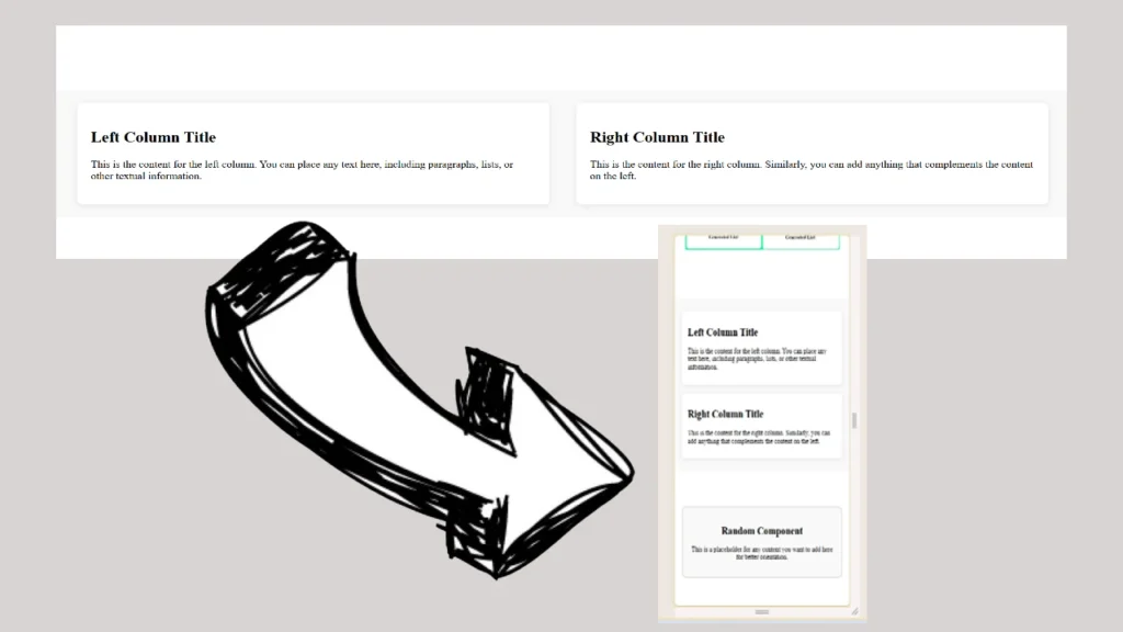
This component consists of two sections: a left column and a right column, each containing text. On larger screens, both sections are displayed side by side, while on smaller screens (like mobile devices), the left column appears on top, and the right column appears below it.
Here’s the HTML I used to structure the component:
<section class="two-column-text">
    <div class="left-column">
        <h2>Left Column Title</h2>
        <p>This is the content for the left column. You can place any text here, including paragraphs, lists, or other textual information.</p>
    </div>
    <div class="right-column">
        <h2>Right Column Title</h2>
        <p>This is the content for the right column. Similarly, you can add anything that complements the content on the left.</p>
    </div>
</section>
This HTML defines a section with two <div> elements, one for each column of content. The styling to make this component responsive is handled entirely through CSS.
The CSS for the Component
The first task was to ensure that on larger screens, the two columns would appear side by side, with some padding and spacing between them. I used flexbox for this:
.two-column-text {
    display: flex;
    justify-content: space-between;
    align-items: flex-start;
    margin: 40px 0;
    padding: 20px;
    background-color: #f9f9f9;
    border-radius: 10px;
}

.left-column,
.right-column {
    flex: 1;
    margin: 0 20px;
    padding: 20px;
    background-color: #fff;
    border-radius: 8px;
    box-shadow: 0 2px 10px rgba(0, 0, 0, 0.1);
}
.two-column-text: This flex container places the left and right columns side by side..left-columnand.right-column: These styles ensure each column takes up equal space and has a distinct background, padding, and shadow for better readability.
Mobile Optimization
To make the component responsive, I used a media query to handle the layout on smaller screens (768px or less). I set flex-direction to column within the media query, which stacks the columns vertically:
@media (max-width: 768px) {
    .two-column-text {
        flex-direction: column;
    }

    .left-column,
    .right-column {
        margin: 10px 0;
        padding: 15px;
    }
}
flex-direction: column: This makes the two columns stack vertically instead of side by side on mobile devices.- Padding adjustments: I reduced the padding and margins slightly for better spacing on smaller screens.