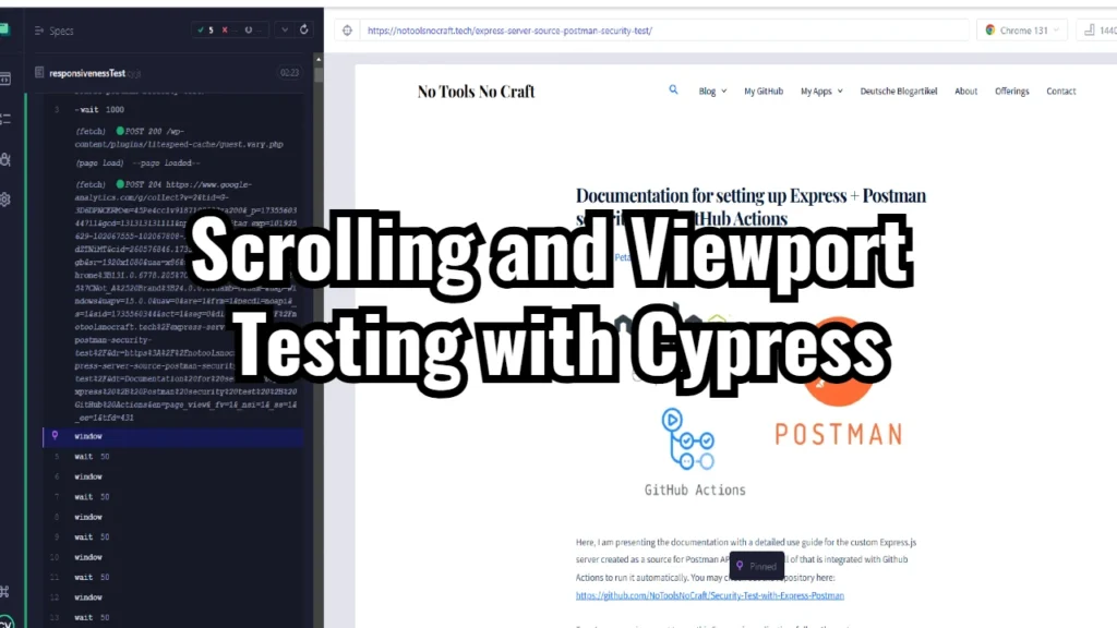
This document serves as a guide to understanding and using the Cypress script provided. The script is designed to test a web page’s responsiveness across various screen sizes and orientations while scrolling through the entire page content.
Purpose of the Script
The script tests the webpage (in our example: https://en.wikipedia.org/wiki/Master_of_Reality) under different viewport configurations. It includes a custom command for smooth scrolling to the bottom of the page, ensuring the entire content loads properly on each tested viewport.
Script Breakdown
Handling Uncaught Exceptions
Cypress.on('uncaught:exception', (err) => {
    console.error('Error:', err.message);
    return false;
});- This ensures that uncaught JavaScript exceptions on the page being tested do not fail the Cypress test.
- Logs the error message for debugging while allowing the test to continue execution.
Base URL Definition
const baseUrl = 'https://en.wikipedia.org/wiki/Master_of_Reality';- Defines the target URL for the tests. This ensures all tests use the same page consistently.
Custom Command: scrollSlowly
Cypress.Commands.add('scrollSlowly', () => {
  function scrollToBottom() {
    cy.window().then((win) => {
      const currentScroll = win.scrollY;
      const maxScroll = win.document.documentElement.scrollHeight - win.innerHeight;

      if (currentScroll < maxScroll) {
        win.scrollBy(0, 150); // Scroll by small increments
        cy.wait(50); // Wait a short period between scroll steps
        scrollToBottom(); // Recursive call to continue scrolling
      }
    });
  }

  scrollToBottom(); // Start the scrolling process
});- Implements a smooth scrolling mechanism by incrementally scrolling the page by 150 pixels and waiting 50ms between each scroll step.
- Recursively continues scrolling until the bottom of the page is reached.
Test Cases
Test 1: Default Screen Size
it('Default screen size', () => {
  cy.viewport(1920, 1080);
  cy.visit(baseUrl).wait(1000);
  cy.scrollSlowly();
  cy.wait(1000);
});- Tests the webpage using a standard desktop resolution of 1920×1080.
- Scrolls through the page to ensure all content is visible.
Test 2: Small Screen Size
it('Single test', () => {
  cy.viewport(640, 480);
  cy.visit(baseUrl).wait(1000);
  cy.scrollSlowly();
  cy.wait(1000);
});- Simulates a small screen size of 640×480 (e.g., older devices or small browser windows).
- Validates content visibility on smaller screens.
Test 3: Multiple Devices
it('Check URL', () => {
  const presents = ['macbook-15', 'samsung-note9', 'ipad-mini', 'iphone-xr'];
  presents.forEach((device) => {
    cy.viewport(device);
    cy.visit(baseUrl);
    cy.scrollSlowly();
    cy.wait(1000);
  });
});- Tests the webpage across a variety of predefined device viewports:
- MacBook Pro 15-inch
- Samsung Note 9
- iPad Mini
- iPhone XR
- Ensures consistent functionality and layout across different devices.
Test 4: Device Orientation
it('Check orientation', () => {
  cy.viewport('samsung-note9', 'landscape');
  cy.visit(baseUrl);
  cy.scrollSlowly();
  cy.viewport('samsung-note9', 'portrait');
  cy.visit(baseUrl);
  cy.scrollSlowly();
  cy.wait(1000);
});- Simulates a Samsung Note 9 in both landscape and portrait orientations.
- Validates the layout and functionality under different orientation settings.
Test 5: Repeated Small Screen Test
it('Single test', () => {
  cy.viewport(640, 480);
  cy.visit(baseUrl);
  cy.scrollSlowly();
  cy.wait(1000);
});- Repeats the small screen size test to validate consistent behavior across multiple runs.
How to Use the Script
- Setup Cypress: Ensure Cypress is installed and configured in your project.
- Add the script to your Cypress test suite.
- Run Tests: Execute the tests using the
cypress runorcypress opencommand. - Analyze Results: Review the logs and outputs to verify if the webpage behaves as expected across all tested viewports and orientations.


