Recently, I worked on building a simple yet functional QR Code Generator app. The idea was to let users input a link, generate a QR code, and add a custom logo. I wanted the app to be fully responsive, working seamlessly across mobile devices’ desktop, portrait (vertical), and landscape (horizontal) modes. While the first version of my app worked well on desktop, I encountered some challenges with the mobile layout, especially in landscape mode. I overcame these issues and got the app working perfectly in all modes.
The Initial Idea
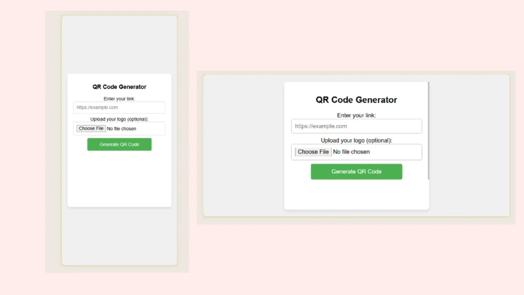
The app has a simple interface with:
- A field for the user to input a URL.
- An optional field to upload a logo to display in the center of the QR code.
- A “Generate QR Code” button.
- The generated QR code displayed below the input fields.
I wanted the app to look clean and organized on all screen sizes, whether it was a large desktop screen or a small mobile device in portrait or landscape mode.
The First Problem I Faced
After writing the initial code, I tested it on my desktop, and everything worked perfectly. But when I opened it on my phone, the landscape mode had issues. The QR code would be generated, but the title of the app, along with some of the input fields, would get cut off at the top of the screen. I couldn’t even scroll up to see them!
In portrait mode, things were better, but not perfect. The input fields and buttons stretched awkwardly across the entire screen, making the layout look unbalanced.
So, what exactly was wrong?
What Was Wrong in the Original Code
In my initial version, I used fixed heights and widths for some elements, which worked great on larger screens but didn’t adapt well to smaller mobile screens. Here were the main issues:
- No scrolling: I had not set up scrolling behavior for the content when it overflowed the screen.
- Fixed sizes: Input fields and buttons were too large on small screens because their sizes were set to fixed values.
- Title cut off in landscape mode: The container’s height was too large in landscape mode, and I hadn’t accounted for it.
- No responsive design: I hadn’t used any media queries to adjust the layout based on screen size and orientation (portrait or landscape).
These problems made the app unusable on mobile devices in landscape mode.
My Final Solution: A Responsive, Mobile-Friendly Design
I took a step back to fix these issues and focused on responsive design. I wanted my layout to adapt based on the screen size and orientation, making sure that:
- The app looks balanced on all screens.
- It doesn’t get cut off in landscape mode.
- The input fields and buttons adjust in size and don’t stretch awkwardly.
Here’s how I approached the problem.
1. Allow Scrolling for Overflowing Content
First, I ensured that users could scroll when content overflowed the screen. To do this, I added the following CSS to the body:
body {
  overflow: auto;
}
This simple addition enabled scrolling when the content was too large for the screen, solving the problem of users unable to scroll up to see the title or input fields.
2. Responsive Input Fields and Buttons
Next, I wanted the input fields and buttons to scale properly on mobile screens. Fixed widths weren’t cutting it, so I used percentages and responsive units like vw (viewport width), which automatically adjust based on the screen size. Here’s how I set the input fields and buttons to be responsive:
input {
  padding: 10px;
  width: 100%;
  box-sizing: border-box;
  font-size: 4vw; /* Responsive font size */
}

button {
  width: 70%;
  font-size: 4vw; /* Responsive button size */
}
By setting the width to 100% for input fields and using vw for font sizes, the fields became much more flexible and scaled nicely on smaller screens.
3. Handling Landscape Mode
The most challenging part was landscape mode on mobile devices. The content was getting cut off at the top, so I needed to make sure that the container adjusted dynamically to the screen size. I set a maximum height for the container and allowed it to scroll within itself if the content became too large:
@media (orientation: landscape) {
  .container {
    max-height: 90vh; /* Prevents the container from exceeding viewport height */
    overflow-y: auto; /* Enables scrolling within the container if content is too long */
  }
}
This max-height: 90vh ensures that the container doesn’t take up more than 90% of the viewport height in landscape mode, leaving space for all the content to be visible.
4. Using Media Queries for Screen Adaptation
Finally, I used media queries to adapt the design based on the screen orientation (portrait or landscape) and screen size. This allows me to adjust the sizes of text, input fields, and buttons to look appropriate on different screens:
@media (orientation: landscape) {
  h1 {
    font-size: 4vw; /* Adjust heading size for landscape */
  }

  input, button {
    font-size: 3vw; /* Adjust inputs and button sizes for landscape */
  }
}

@media (min-width: 768px) {
  h1 {
    font-size: 24px; /* Fix size on larger screens */
  }

  input, button {
    font-size: 16px; /* Fix size on larger screens */
  }
}
By adjusting the sizes based on the screen width (min-width) and orientation (orientation), I could fine-tune how the app looked across different devices.
The Final Result
After implementing these fixes, the app now works perfectly in desktop, portrait, and landscape modes. The input fields and buttons are appropriately sized, the content doesn’t get cut off, and the QR code is easily viewable and downloadable on any device.
I learned that responsive design is all about flexibility — ensuring your layout adapts to different screen sizes and orientations. By using responsive units like vw and leveraging media queries, I made a simple app much more user-friendly across various devices.
Key Takeaways for Beginners:
- Use responsive units like
vwand percentages to make sure your elements scale with the screen. - Always test your app on different devices and in different orientations. A design that looks great on desktop may break on mobile.
- Allow scrolling when content overflows, especially on mobile devices.
- Media queries are your friend. They let you adapt your design based on screen size and orientation.
